District 4 has New Name and Logo

By Bart Ney
Have you seen it yet? Caltrans District 4 has a new look and feel. A new logo has been developed to represent Caltrans in the Bay Area, and it has been softly launched and incorporated in a few presentations and some employees have used it in their email signature in advance of the new brand's official launch.That launch starts with this article!
It all began with a question posed by District 4 Director Tony Tavares to the team working on the new Strategic Action Plan. “How can we better serve our community and inspire our workforce?”
From that question came the six areas of focus:
1. Promote Ownership, Accountability & Safety
2. Cultivate Partnerships & External Communication
3. Develop & Retain an Engaged & Empowered Team
4. Leverage Technology
5. Foster a Complete Transportation Network
6. Enhance Internal Communication
As the Strategic Action Plan was being developed in 2019, our Public Affairs Division and Audio-Visual Unit got to work on a new identity to support these six priorities with the goal of shaping the future of Caltrans in the Bay Area.
Great logos are a powerful tool. But how do you make a great logo? The most successful logos are 1) Simple 2) Relevant 3) Traditional 4) Distinct and 5) Scalable. For District 4, this new look would need to include elements that would naturally connect with the classic Caltrans logo while firmly placing the department in the Bay Area.

There are two key elements of the new logo. The “bug” or icon is a picture so recognizable that it can stand on its own. The font must be immediately identifiable as “Caltrans.” Together these elements make the logo.
One reason for developing the logo was to make it simpler for each district and its partners to communicate with each other and the public. The Bay Area will always be District 4 for Caltrans, but districts are numbered differently, both politically and in other agencies. So, a new naming convention had to be implemented. Going forward, we will refer to District 4 as Caltrans Bay Area to make it clear our department is here to serve the nine counties by the Bay.

To create the “bug,” designer Phillip Anderson looked at the most familiar icons in our region: the Bay Area’s bridges. The Toll Bridge Program had inspired the Golden State Warriors to adopt a new logo. The image accompanied them as they rose to the top tier of the NBA. So why not work with that successful image and pair it with our classic District number to create an image that cleverly addresses both? The results speak for themselves. The new image looks like it’s been around forever while paying homage to what came before.
The font was a little trickier. Although it seems natural to use the classic Caltrans font, that font does not, in fact, exist; our logo lettering is all there is. So, Phillip worked with his boss, Marissa Parez-Mijares, who also has a history of working on these types of graphics, to expand the pallet and create the “Bay Area” lettering that makes up our new logo.
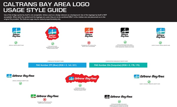
With a strong understanding of the need for the logo to support the implementation of the District’s Strategic Action Plan and to reduce confusion with messaging, the team had to look at how the new logo would work. Rules of the road were needed, so the team created a “Style Guide," a helpful reference for employees who wish to incorporate the new logo into their work.
 The simple one-page guide has both horizontal and vertical “lock-ups” or designs for use in different situations. It also has the official PMS color numbers for the Caltrans palate and a few examples of proper and improper usage.
As District 4 moves FORWARD in the implementation of its strategic priorities, it is proud of its Bay Area ties and affirms that identity with a logo that honors its history and celebrates its community.
To get the official new Caltrans Bay Area Logo to use digitally as well as the Style Guide, please bookmark this link.
We are currently looking for volunteers that will assist in the implementation of these six new priorities.

